The Koded Company · studio website
An honest site for a one-person studio.
thekoded.com is my own studio's site. The first version looked expensive and described a company that didn't exist: unnamed clients, a team, a 100% retention rate. I rebuilt it around work you can open, the one person you'd actually talk to, and an enquiry form that writes the brief for you.
- Role
- Owner: design, copy and build
- Platform
- Static site on Hostinger
- Built with
- HTML, CSS, JavaScript, Formspree
- Status
- Redesign of a live site
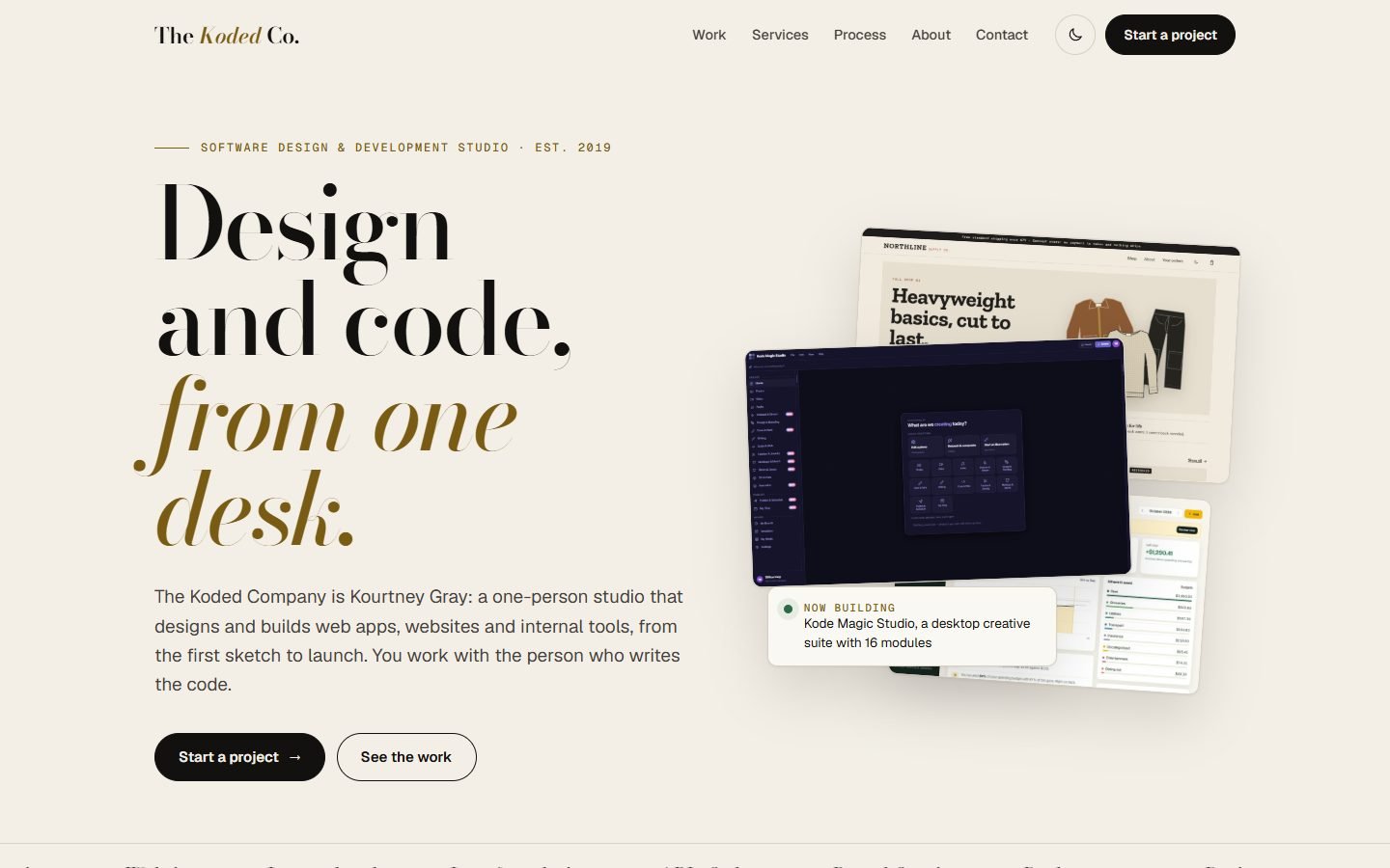
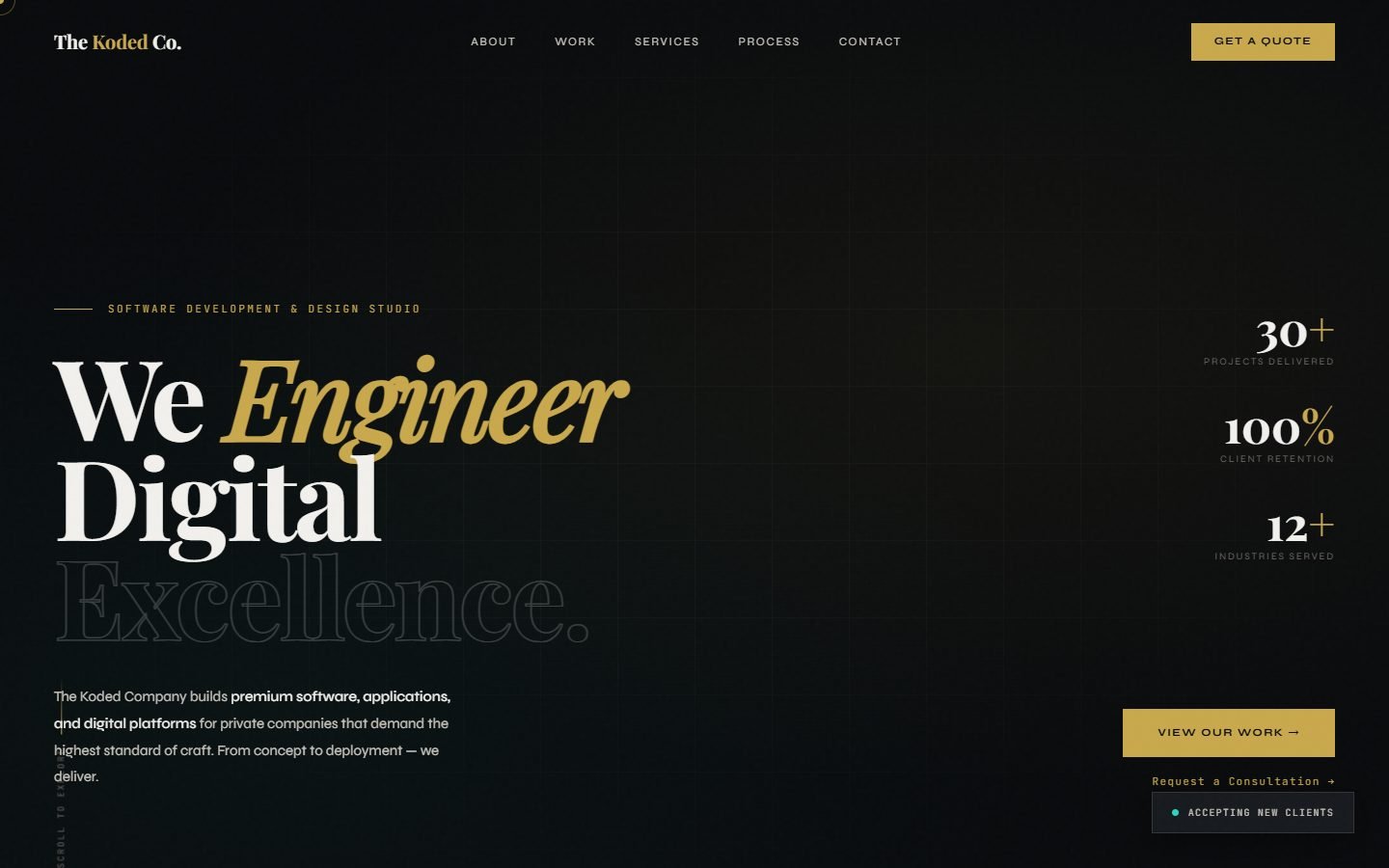 BeforeAfter
Drag across, or use the arrow keys. Both are the home page at 1440 px.
01 / The problem
The old site sold a studio that didn't exist.
It was built to look like an agency, because agencies win bigger work. But everything a visitor could check would fall apart on the first call, and the work I'd actually done wasn't on it at all.
Six "private projects" for a private equity firm, a hotel group, a hospital network, a property developer, a fashion house and a law firm. None of them were real. A line said client names were confidential
, which made them impossible to check.
Counters ran up to 30+ projects, 100% client retention and 12+ industries. A badge claimed a 100% satisfaction rate, and the process section mentioned dozens of high-stakes private engagements
.
"Our Studio" listed me beside Software Engineering and Design & UX, laid out like colleagues. It's just me. There was also a price list and "a select number of private clients each quarter".
Why fix it: a studio of one person is a selling point if you say so. Clients get the person who writes the code, so nothing is lost in a hand-off. The old site hid the strongest true thing about Koded behind things that weren't true.
02 / Before and after
What changed, section by section.
Same domain, same email address, same form endpoint, so enquiries still reach the same inbox. Almost every word and every layout is new. Select a screen to see it larger.
The first screen
HeroWho you'd work with
AboutThe work
ProjectsGetting in touch
ContactOn a phone
390 px03 / The enquiry form
Answer four questions, get a brief.
The old form asked people to choose a budget range before I knew what they needed. Now they say what they're making, and the page turns the answers into a sentence that leads the message.
- 1
What are you making? A website, a web app, an internal tool, an app, design work, or not sure yet.
- 2
Where is it now? Just an idea, sketches, or something that exists and needs work.
- 3
What will it need? Accounts, payments, an admin area, editable content, imports, connections. Pick any.
- 4
When? As soon as possible, in one to three months, later, or flexible.
The brief it writesA web app, sketches or designs. Needs: accounts and logins, payments, an admin area. Timing: in 1 to 3 months.
  function brief() {
    const a = answers, parts = [];
    if (a.what) parts.push(a.what);
    if (a.stage) parts.push(a.stage.toLowerCase());
    let s = parts.length ? parts.join(", ") + "." : "";
    if (a.needs && a.needs.length) s += (s ? " " : "") + "Needs: " + a.needs.join(", ").toLowerCase() + ".";
    if (a.when) s += (s ? " " : "") + "Timing: " + a.when.toLowerCase() + ".";
    return s;
  }
  form.addEventListener("submit", async (e) => {
    e.preventDefault();
    const ok = ["name", "email", "message"].map((k) => check(form.elements[k])).every(Boolean);
    if (!ok) { note.className = "form-note bad"; note.textContent = "A couple of things need fixing before this can go."; form.querySelector("[aria-invalid=true]").focus(); return; }
    const p = payload(), btn = form.querySelector("[type=submit]");
    if (!LIVE) {
      note.className = "form-note ok";
      note.textContent = "Preview only: on thekoded.com this would be sent to Kourtney. It would read: “" + p.message.slice(0, 220) + (p.message.length > 220 ? "…" : "") + "”";
      toast("Preview: nothing was sent");
      return;
    }
Only the real site sends. The form posts to Formspree only on thekoded.com. Everywhere else, including the copy on this page, it shows what would have been sent and sends nothing. Answers and the half-written message are saved in the browser, so a reload doesn't lose them.
04 / The new site
Quiet paper, brass, and the work up front.
Bodoni Moda for headings, Geist for everything else, and one accent colour. The site keeps the old dark-and-gold feeling in dark mode and adds a light one. Select any screen to see it larger.
05 / Try it
The new site, running here.
This is the same code that goes to thekoded.com. Because it isn't on that domain, the enquiry form runs in preview mode and sends nothing.
- 1
Filter to "Data & tools" and open Ledgerline. Use the arrow keys to move through its screens.
- 2
Answer the four questions under Contact and watch the brief write itself.
- 3
Send it. You'll see exactly what would arrive in my inbox, and nothing is sent.
Nothing to install, no analytics and no cookies.
Open it full size06 / How it's built
Four files, and a form service I already had.
A studio site doesn't need a framework. It's plain HTML, CSS and JavaScript on the same Hostinger plan, so uploading a zip replaces the old site and nothing else changes.
- 825lines of HTML, CSS and JavaScript
- 10projects, each one you can open
- 0frameworks, build steps or analytics
- 1form endpoint, unchanged from before
- The work is datawork.js lists every project once: its label, year, what I did, stack, captions and links. The grid, the filters and their counts, and the project dialog are all drawn from that list, so adding a project is one entry and its images.
- Projects have addressesOpening a project sets #work/its-name in the address bar. Share that link and the project opens when the page loads.
- The form keeps its old destinationIt posts JSON to the same Formspree form as before, with the brief at the top of the message. If sending fails, the message stays put and a link offers to send it by email instead.
- Errors next to the fieldName, email and a sentence about the project are checked before sending. Each problem appears under its field and the first one gets focus.
- Light and dark, both designedColours are tokens with a dark set. The accent was darkened in light mode so small brass text still reads clearly on paper.
07 / What I'd test next
Does it bring better enquiries?
The site is honest now. Whether it works as a shop window is a separate question, and the enquiries themselves will answer it.
Compare the next enquiries with the old ones: do they say what's being built, and how far along it is? If people skip the questions, they're in the way.
Measure: first-reply questions per enquiryAsk the next few people who get in touch what nearly stopped them. If size worries come up, the answer is a clearer note on how I cover holidays and handovers.
Test: three short callsA public form will collect spam. Formspree filters some; a hidden honeypot field would catch most of the rest without a CAPTCHA.
Next: honeypot fieldProjects open in a dialog and link to graystack.me for the full study. A page per project on thekoded.com would be easier to share and to find in search.
Next: project pages from work.js